airspeed.m version 01Jul23
(Aircraft performance, the power required equation, & regression analysis)

The purpose of this application is threefold:

Linear and non-linear regression

There are three situations related to this application where it will be necessary to estimate the parameters of an equation to produce the best fit to a data set. This is called curve-fitting, or regression analysis. Here is a script designed to create a non-linear air density model and create the two plots shown below:
% Plots the residuals for two possible altitude models to see which one is better --------------
  d = [0    1      2      3      4      5      6      7      8      9    10;     % Altitude (km)
       1 .90748 .82162 .74214 .66868 .60091 .53853 .48123 .42871 .38069 .33690]; % density ratio
  % The data above is from the 1976 US Standard Atmosphere, US Government Printing Office:
  % https://ntrs.nasa.gov/api/citations/19770009539/downloads/19770009539.pdf
  % starting on page 67 of the pdf document (last column of the table)
  ktf = 1000/(25.4 * 12);  % convert km to thousands of feet
  a = d(1,:) * ktf;        % altitude in thousands of feet
  s = d(2,:);              % density ratio
  alt = (0:.01:10) * ktf;  % x axis for extrapolated values (every 10 meters)
  k = 1:100:1001;          % indices into alt for every 1000 meters
  tid = {'Calc' 'True' 'Resid'};  xlbl = 'Thousands of feet';
  % The density ratio must decay to 0 at infinite altitude and is defined to be 1.0 at sea level.
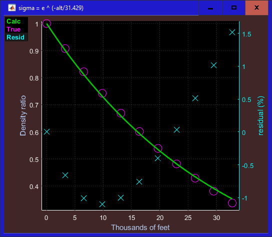
  % The simplest model satisfying these conditions is the single parameter model: e ^ (-alt/p) 
  p = fminsearch(@(p,a,s) norm(exp(-a/p) - s),1,[],a,s);
  t = prin('sigma = e ^ (-alt/%6w)',p);   % show the model in the figure name
  S = exp(-alt/p);                        % extrapolate density ratio from model
  plt(alt,S,a,s,a,(S(k)-s)*100,'Ylabel',{'Density ratio' 'residual (%)'},...
     'FigName',t,'Xlabel',xlbl,'Styles','-ox','MarkerSize',12,'TraceID',tid);
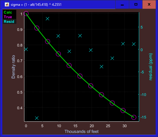
  % This two-parameter model also satisfies those conditions: (1-alt/b) ^ c --------------------
  p = fminsearch(@(p,a,s) norm((1-a/p(1)).^p(2) - s),[100 1],[],a,s);
  t = prin('sigma = (1 - alt/%6w) ^ %6w',p); % show the model in the figure name
  S = (1-alt/p(1)) .^ p(2);                  % extrapolate density ratio from model
  plt(alt,S,a,s,a,(S(k)-s)*1e6,'Ylabel',{'Density ratio' 'residual (ppm)'},...
     'FigName',t,'Xlabel',xlbl,'Styles','-ox','MarkerSize',12,'TraceID',tid);

The first fminsearch above estimates the single parameter for this simple model:

σ = e-alt/p   where alt is the altitude in thousands of feet.

Matlab's fminsearch function uses the Nelder-Mead method for finding the minimum of a non-linear multidimensional function, although in this first case, the function is one-dimensional. It estimates the single parameter p to be 31.429 which you can see in the title bar.

The fminsearch is followed by a plt command which produces the figure you see here. Note that the model (green trace) goes through (more or less) the true data represented by the purple circles. So it isn't a terrible fit, although the worst case residual which occurs at 10km altitude (32,808 feet) is 1.5 percent - a noticeable error. More telling is that the residuals appear to follow a distinctive pattern (a quadratic). Patterns in the residuals usually indicate that a better model is possible.

(A positive residual indicates the calculated density ratio is larger than the true value.)

The previous model is the most obvious candidate for a function that starts at one and eventually decays to zero, but it is not the only choice. The next most obvious equation that meets those requirements is:

σ = (1 - alt/b)c   where alt is the altitude in thousands of feet.

The second fminsearch in the code above finds the best fit for the two parameters (b & c) in this alternative model.

The plt command following the fminsearch produces the figure shown here.

This is a multi-dimensional search for p = [b c] and the best fit values for these two parameters can be found in the title bar.

The worst case residual which occurs at 1km altitude (3,281 feet) is about 15 parts per million which is three orders of magnitude better than the first model calculated above. This is clearly the preferred model to use and is more than accurate enough to use for generating the aircraft performance curves.

The power required equation

The next thing we must wrap our brains around to be able to understand this application is the meaning of the power required equation:
   Pr  =  c σ v3    +    
k
σ v
where:     Pr   is the Power Required to maintain level flight
v   is the true airspeed
σ   is the air density
c   is the parasitic drag coefficient
k   is the induced drag coefficient

There are two drag forces that we must overcome to maintain flight. The first drag force is called parasitic drag and can be thought of as the force required to push the air out of the way. This is related to the size and shape of the aircraft's frontal area - both factors which affect c, the parasitic drag coefficient in the first term of the Pr equation. To understand why this term is proportional to velocity cubed, consider the force required to push an object thru a fluid or gas. If the object is moving very slowly, the fluid can move smoothly out of the way (laminar flow) and this drag force will grow linearly with the velocity (i.e. if the velocity doubles, the drag force also doubles). However, if the object moves more quickly, the fluid can't flow smoothly around the object and the flow becomes turbulent. This increases the pressure in front of the object by an amount that is also proportional to velocity making the drag force grow in proportion to the square of velocity. (This is not a proof, but at least a plausibility argument that parasitic drag is related to v2).

Now the work required to push the object thru the fluid a distance (Δd) is the drag force times the distance. (W = F Δd). Power is the work expended per unit time (W/Δt) so the power required is FΔd/Δt, or Fv. So if the force is proportional to v2, the power will be proportional to v3. Since it will require more power to push a thicker fluid out of the way it is also plausible that the power will be proportional to the air density σ, justifying the first term in the Pr equation.

The second drag force is known as induced drag and arises from the requirement that the wings direct the air mass that it is running into downward at a rate fast enough to provide enough lift to keep the aircraft at a steady altitude. Intuitively this becomes more difficult and less efficient when the airplane is moving through the air more slowly and when the air is less dense. This is evidence that the induced drag will be inversely proportional to both velocity and air density (although again doesn't constitute a proof). A complete proof of this equation would require a more solid grounding in fluid dynamics than I can offer.

Aircraft parameters

All the performance curves and characteristics shown in this application are derived from just five parameters: The first three parameters are easily found in the airplane operating handbook or engine manual. However the drag coefficients are not published by the manufacturers, so we will have to calculate these two coefficients from airspeed measurements made while flying. (See the section Making measurements for the aircraft configuration file below.)

When this application starts, it looks for these measurements as well as the first three parameters listed above in a text file called airspeed.txt in the plt\ini folder. Unless you have modified it, this file will have the following contents:
Aircraft configuration file: N3946Q: Cessna 185 with IO550

BSFC      : .40067
hpMax     : 300
Fuel (gal): 76

 alt     tas     gph
-----   -----   -----
 4000    71.4    5.7
16000    62.2    7.8
16000   113.4    7.8
 4000   124.6    10
20000   155.0    12
 8000   150.0    14
12000   160.4    15
You can edit this file to contain the parameters and measurements from your aircraft of interest, or you can save the file with a different name if you want to analyze more than one aircraft. You shouldn't modify the formatting of this parameter file, so restrict your modifications to the numbers in the file, as well as the text in the first line which contains the aircraft type and identifier. The three headings for the measurements stand for altitude (in feet), true airspeed (in knots), and gallons per hour (fuel flow).

The parameters and measurements shown above are associated with the airplane I own - a Cessna 185 with a turbo-normalized IO550 engine. It's a good idea to include the aircraft N number in the ID field as I have done here. Otherwise, you might lead someone to assume that two airplanes of the same type will have the same performance characteristics. That is rarely true since most aircraft have been modified since leaving the factory. For instance, the airplane used in this example has aftermarket wheel fairings, flap gap seals, and other aerodynamic modifications installed as well as additional antennas and strobe lights all of which affect drag.

Note that seven measurements have been included in the supplied configuration file, although you can include as many measurements as you like. (Some tips on how to make these measurements are given near the end of this section.) More measurements generally will give you a more accurate estimate of the two drag coefficients. Theoretically, just two measurements made at different altitudes or power settings are sufficient to estimate the two drag coefficients. However, that isn't likely to result in a good estimate. The residuals from the regression analysis will give you an indication of how confident you should be with the estimates of the drag coefficients. (This is explained in the section below titled "Residuals".

The True Airspeed Chart


If you have not edited the aircraft configuration file (plt\ini\airspeed.txt), then when you start airspeed.m you will see this figure (the True Airspeed chart) along with another figure (the Efficiency & Range chart shown below). Note that the aircraft identifier from the first line of the config file is put into the text block in the upper right corner of the figure. Also, the 3 parameters in the config file are copied to the BSFC, hpMAx, and Usable fuel edit boxes above the plot. The next thing the application does it to do a regression (again using fminsearch) to estimate the two drag coefficients to best fit the alt/tas/gps data in the config file. These coefficients are then put into the two drag coefficient edit boxes next to the other parameters. Then the application extrapolates the airspeed curves you see here for 9 different altitudes ranging from 0 to 32,000 feet. (Ignore the circle markers for now, as I will explain their meaning later.)

Since the power required equation is so central to this application, the equation along with a description of the variables is shown in the lower right corner of the plot. If it becomes distracting, right click on the Help tag in the menu box to make it vanish, or reappear. (Left click on that tag to see the document you are now reading.)

Although you can experiment to see the effects of changing a parameter by editing the config file, it's faster to edit any of the 5 parameters directly in the airspeed chart. To change a parameter by a small amount, simply click on the parameter value. Clicking slightly to the right of the center of the number will cause the number to increase and clicking slightly to the left of center will decrease the number. To make a larger change, right click on the number, press the down arrow key to erase the number, and then type in the desired value.
As soon as you change the value of any of the 5 parameters, the string (modified) is added to the end of the aircraft ID field to indicate that the plots no longer correspond to the data in the config file. To restore the parameters and plots, left click on this text box, and the data will be read in again from the text file and the modified string will be removed. Or if you want to read in a different aircraft configuration file, right click on the text box and a file selection box will appear allowing you to select the file you want. After selecting the file, the text box will show the aircraft identifier in that file and the five edit boxes above the plot will be updated to match the parameters in the selected file.

Note that there are two x-axes, one on the top and one on the bottom. Percent power can be computed from the fuel flow and visa versa (using BSFC and hpMax) but having both of these axes can be convenient. The default x axis limits, as seen here are from 50 to 85 percent power since most of your cruise flying will be in that range. Also, the y axis limits have been expanded to show only the front side of the power curve for the same reason. If you want to see the entire curve, (front and back side of the power curve, from minimum cruise power to 100%) click on the xy toggle tag (XY ←→) in the menu box or use any of the panning or zooming methods described here.


In case you aren't that familiar with the concept of the back side of the power curve, let's pan this display so that we see more of the slow and low power portion of this airspeed chart as we see in this figure. (I've also disabled all the traces except the 8,000 ft curve and cropped off part of the chart.) Suppose we are cruising along at 8000 feet happily at 60% power. If you put the cursor on that point (where the blue arrow is) you will see that you will true out at 140.3 knots with a fuel burn of 12 gph. I haven't discussed the efficiency chart yet, but we will be able to see from that chart that we will be traveling 11.69 nm per gallon of fuel.

Now suppose you start getting worried that you might not have enough fuel to reach your destination. Your reaction to this concern (if you have been properly trained) will be to pull back on the power somewhat and as you do this you will notice that your airspeed decreases as expected (assuming of course you retrim to maintain 8000 feet). But how far can you go? This chart will tell us. Let's drag the cursor to the farthest left that it can go (as shown in this figure). It is a little tricky to find this point on the curve, but it helps to move the cursor slowly back and forth by right or left clicking on the Xaxis label (Percent power) and stop when the percent power readout (after the "x" label) or the gph readout is the smallest you can get. (This is where the yellow "+" cursor is in this figure.) Here we can see that the fuel flow will be just a hair over 6gph and your airspeed will be 75.9 knots, and by looking at the efficiency chart we will see that the efficiency is now 12.55 nm per gallon which means that we can now travel 7.4 percent farther than before. This speed is known as the minimum power speed, or also known as Vme, the maximum endurance speed (i.e. the speed where we can stay at 8000 feet for the longest time before running out of fuel). If you try to reduce the fuel flow any more, you will find it impossible to maintain your 8000 ft altitude.

But is this the speed that will maximize the chance to make it to our destination? The answer is no. Consider the point on this curve shown by the green arrow at 99.9 knots and 34.5% power (6.9 gph). That will give us an efficiency of 14.49 nm/gal meaning we could travel an impressive 24% farther than we could have at our original 60% power setting. This turns out to be the best we can do. (i.e. flying either slower or faster will reduce our range). This speed is called Vmr, the maximum range speed (which will vary with altitude) and also sometimes is called the best L/D (lift to drag ratio). But how can we tell from this chart that this is the maximum range? This is somewhat difficult, but if we pan the display so that we can see the origin (i.e. zero on both axes), then if we draw a line from the origin so that it is tangent to this curve, that line will touch the curve at this exact point. Can you figure out why this works? (Consider that we are looking for the highest ratio of speed over power.) Fortunately, we will see that there is a much easier way to find this point when we later discuss the efficiency chart.


Although Vmr and Vme both vary with altitude, there is an interesting relationship between them. An easy-to-remember rough rule of thumb is that Vme is about 3/4 of Vmr. To be more precise, the exact value of this ratio is the fourth root of 1/3 or about .7598. The Vme/Vmr ratio using the numbers in the paragraphs above is 75.9/99.9 = .7596. As you can see, this is very close to the fourth root of 1/3 but not quite. The Vme/Vmr ratio however is exact for any aircraft at any altitude (not an approximation). The reason we didn't get exactly the fourth root of 1/3 here is because of the limited resolution of the airspeed plot (0.1 knots in this case). If we were to increase the resolution, the computed ratio will get closer to the true value. (Increasing the plot resolution would be pointless however since the resolution already exceeds the accuracy for our speed measurements.) The value of this speed ratio can be computed from the Pr equation. If you are interested in this calculation, click on the thumbnail on the left.

Now suppose we want to fly even slower than 75.9 knots (Vme), say 55 knots for example. Is this even possible? According to this chart, the answer is yes. Put the cursor on the curve at 55 knots (near the red arrow) and it will show you that you would have to increase the power setting to 6.837gph (13% higher than at the maximum endurance speed). Perhaps because it is somewhat counterintuitive to have to add power to go slower, this portion of the curve is known as the back side of the power curve. There would be little occasion to use such a slow speed during cruise, but one example might be to minimize the disruption in the cockpit when you needed to open a window or a door (perhaps to allow a parachutist to deplane, or to dump the ashes of a friend or relative over the ocean). Of course, during the takeoff and landing phases of flight, the use of the back side of the power curve will be much more important. So why did we have to increase power to go slower? The answer is that at such slow speeds, the induced drag becomes dominant. Remember from our power required curve, the induced drag is inversely proportional to velocity. So even though the parasitic drag continues to drop as we fly slower, in this portion of the curve that drop is outweighed by the increase in induced drag.

For the performance curves shown above in the airspeed chart, it is convenient to have power on the x axis since that is the variable we can control, with airspeed on the y axis as the consequence of that power choice. However the airspeed is the independent variable for the Pr equation, so it is also useful to view these curves as functions with airspeed on the x axis, and in fact this is the way you usually find the Pr curves depicted in aerodynamics textbooks. To view the curves that way, you can swap the x and y axes by RIGHT clicking on the LinX tag in the menu box. This produces a display similar to what is shown here. Even in the swapped view, the cursor will remain properly synchronized with the cursor in the Efficiency & Range chart discussed below. One advantage of this swapped view is that it is quite easy to find Vme (minimum power) by simply clicking on the valley finder cursor button (down arrow). As we described before, finding Vme in the original view involved some back-and-forth cursor movement while looking for the smallest power value. Once you have the cursor on Vme (as in this screenshot - for the 8,000 ft curve) you can right click on the LinX tag a second time to swap the x and y axes back to the original configuration, and the cursor will still remain on Vme.

The Efficiency & Range chart


This is the default view for the Efficiency and Range chart. The lower and upper X axis is Percent power and Fuel flow respectively, just like the Airspeed chart, although here the default limits show the full power range, from the minimum possible power up to 100%. The Y axis is nm per gallon (a measure of efficiency) and we have Range (also a measure of efficiency) on the alternate axis on the right side of the graph.

Suppose we are planning a flight where we expect to cruise at 8000 feet at 70% power. We can place the cursor at that point as shown in this figure. Next to the x cursor readout, we can see that we will be burning 14 gallons of fuel per hour. The y cursor readout shows that we will be traveling 10.72 nautical miles for every gallon burned (assuming no wind) and next to that, we can see that we will have a range of 814.82 nm. Of course, we should not plan on going that far since we need to observe the reserve requirements of the FARs, not to mention some fuel will be used up for takeoff and climbout. (The fuel required to climb can mostly be recovered in the decent with wise power management.) We can't see what the airspeed will be on this chart, but if we look over at the airspeed chart, we see right away that the TAS will be 150.2 knots. We don't even have to move the cursor on the airspeed chart to see this because the cursors are linked between the two charts. Moving the cursor to 70% power on the efficiency chart will automatically move the cursor to 70% power on the airspeed chart (and vice versa).

Near the upper right corner, we see the yellow text "Lift portion: 16.37% which means that 16.37% of the power used at the cursored position (70% power, 8000 feet) is used to generate lift and the remaining 83.63% is used to push the air out of the way. Note that if we move the cursor to a higher altitude curve, the lift portion increases. This is because it requires less work to push the thinner air out of the way, so a higher percentage of the total will be due to the induced drag. Slow down to the maximum range point and you will see the lift portion increase to around 50% (depending on altitude) and increase again to around 75% at the maximum endurance point. By the time you are well into the back side of the power curve, you will see that the lift portion exceeds 90%.

Suppose you want to know what the maximum range airspeed is for this altitude. Simply click on the peak finder button (The up arrow in the 4 button group in the lower left corner.) The cursor will jump right to the 6.9gph point (with 14.49 nm/gal) that we found before using the speed chart. (Notice how much easier this is, using the efficiency chart). You will also see that the range will be 1101.2 nm and that the airspeed required to achieve this range is 100 knots (by looking at the linked cursor in the airspeed chart.


The traces are pretty close together in this maximum range region, so let's zoom the display so we can see this area more clearly. The cursor is at the peak of the 8000 ft curve (after hitting the peak finder button). Notice that the peaks of the other curves are at the same efficiency level (14.49 nm/gal and 1101.2 nm range), although this is achieved at different airspeeds. For example, click on the blue 20,000 ft curve and click again on the peak finder button. The range is still 1101.2 nm as before but now we will be flying at a higher airspeed (121.4 knots) and a higher power setting (8.38 gph), so it will take us significantly less time to reach our destination. This shows the advantage of a higher altitude, but the higher altitude may not always be practical. (The best altitude to use is usually a combination of factors including efficiency, terrain, availability of supplemental oxygen, winds, clouds, icing, and other weather conditions.) This chart shows us the efficiency advantage of the lower power settings in a dramatic way, yet not many pilots fully appreciate this. Even with this knowledge, few pilots will have the patience to fly that slowly unless forced to by dwindling fuel reserves.


Here I have expanded the display somewhat near the low end of the power range and placed the cursor on the maximum range point on the 8,000-foot curve. As before, finding the exact minimum fuel flow point requires moving the cursor slowly back and forth while looking for the smallest fuel flow or percent power. (Left and right clicking on the X-axis label is a convenient way of moving the cursor back and forth one index at a time.) If you look above at the partial screen capture of the airspeed chart (the one with the blue, green, and red arrows), the cursor position in that plot corresponds to the cursored position shown here. And since the cursors are linked, finding this point on one curve will automatically place the cursor at the corresponding point on the other curve. Notice that the maximum range points for all the other altitude curves occur at the same efficiency (12.56 nm/gal). As with the other chart, the portion of the curve below the cursored position is the back side of the power curve where you progress to lower airspeeds, higher power settings, lower range, and lower fuel efficiencies.

The aircraft used to create the supplied default aircraft configuration file (N3946Q) has a turbonormalizer. A turbonormalizer compresses the air from the air intake so that the air that is sent to the engine has the same density as sea-level air, even when flying at altitude. This allows the engine to produce full power even as you climb into thinner air. However no turbo has infinite capacity, so if you climb high enough, the maximum power produced will fall below 100%. For simplicity, this application does not model that limitation, and all the curves extend up to 100% power for all altitudes. Even where 100% power is possible, that doesn't mean you can fly at full power for long. In fact with large engines such as the IO550 you can rarely operate at more than 80% power for long without overheating the cylinders.

But what about aircraft that don't have the benefit of having a turbo installed? Engines without such equipment are called "normally aspirated" because the engine breathes the same ambient air that the pilot and passengers breathe (assuming the cabin is not pressurized). The engine needs oxygen to support combustion and so it doesn't perform as well breathing the thinner air just as the pilot also doesn't perform as well breathing the thin air. (BTW, most airplanes in the general aviation fleet have normally aspirated engines as well as unpressurized cockpits.) Now we are finally in a position to explain the circle markers on the traces in both the airspeed and efficiency charts.

Consider, for example, flying at 16,000 feet on a standard day. Looking at our two-parameter altitude model we can see that the air density ratio at that altitude is 0.608. This means that a normally aspirated engine operating at that altitude can only generate 60.8 percent of its rated power. Notice that the red circle on the red (16,000 ft) trace is exactly at that value (60.8%) and so a normally aspirated airplane can't operate to the right of that circle when flying at 16,000 feet.

Notice that there is no orange circle on the orange (28,000 ft) trace. (At first, it may look like the white circle for the 24,000 ft trace also passes thru the orange trace, but if you look at the expanded view above, you can see that the white circle is not actually on the orange trace. (Even if it was, that would not have any significance.) From our altitude model, we see that the air density ratio at 24,000 feet is 0.4025. So a normally aspirated engine at that altitude could produce no more than 40.25% power. However, from the efficiency plot, we can see that 42.27% power is the minimum power setting compatible with level flight (the maximum endurance setting). So that tells us we wouldn't have enough power to maintain that altitude, not to mention to climb up to that altitude in the first place. (Of course, none of these limitations apply to the turbonormalized airplane used in this example.)

Drag components


As we discussed above, the Lift portion text near the upper right corner of the plot, displays the percentage of power that is used to create lift at the altitude and airspeed corresponding to the cursor position.


Suppose we have the cursor somewhere on the 8,000 ft curve and then we click on the Lift portion text. That will bring up the plot you see here showing Pr vs. Airspeed for the 8,000 ft curve (in green - trace #1). Also the value for the first term of the Pr curve (parasitic) is plotted in purple, and the value for the second term (induced) is plotted in cyan.

Although these drag component curves don't have much use in determining your aircraft's performance, they can help you understand some of the theoretical considerations, as well as give you an appreciation for how insignificant the parasitic drag is on the back side of the power curve. Remarkably the two component curves cross each other at precisely Vmr (max range). Click on the equation thumbnail above to see a proof of this fact.

Residuals


After reading the aircraft configuration file, fminsearch is used to estimate the parasitic and induced drag coefficients so that the power required curve comes as close as possible (in the least squares sense) to the measurements included in the configuration file. Using this estimate for the drag coefficients the average difference between the power required calculated from the power required curve and the power required specified in the configuration file measurements is computed and displayed in the upper left corner of the Efficiency plot as shown here. A small value (as we have here) indicates that the measurements in the configuration file are consistent. The regression error is not useful if only two measurements were included. In that case, the two data points will always be perfectly consistent since two drag coefficients can be chosen to match the two measurements exactly producing a regression error or zero (or nearly so).


Especially when the regression error is not small, it can be useful to look at the individual residuals for each measurement point. To do this, simply click on the residual text on the screen and a figure such as this will appear.

The X axis is the measurement number, so the leftmost point is the residual for the first measurement in the file and the rightmost point is the residual for the last measurement. The first three columns of the table shown in the upper right corner of the plot are the same as the 3 columns of data included in the configuration file. The fourth column is the residual associated with each measurement, so it shows the same information as the plotted trace. (In most cases it is easier to interpret the plotted residuals instead of the numerical values shown in the table.) Here the largest residual is the sixth measurement, but the residual is not much larger than some of the other values so the sixth measurement wouldn't be considered an outlier. If one of the residuals is much larger than the others, the associated measurement might have been made or recorded incorrectly. Rather than simply throwing out that measurement, it would be best to make the measurement again to verify its accuracy. (It is possible that it's the most accurate measurement in the file in which case throwing it out would be a disadvantage.)

Making measurements for the aircraft configuration file

The ability of this application to create accurate performance curves hinges on the accuracy of the measurements included in the aircraft configuration file. The airspeed indicator measures ram air pressure which is correlated with what is known as "indicated airspeed", which tracks true airspeed at sea level, but reads lower than true airspeed at higher altitudes. The indicated airspeed can be corrected for the thinner air at higher altitudes to give an estimate of true airspeed. This correction can be done using tables, or equations, and is sometimes built into a dial on the airspeed indicator itself. Still, the problem with using the airspeed indicator for the configuration file measurements is that they are notoriously inaccurate. Errors of 5 knots or more are quite common.

A better way to make these measurements is by using GPS data. It's not as simple as reading the airspeed reported the GPS since the GPS reports ground speed, not airspeed. We can compute the true airspeed from the ground speed by using wind forecasts, however, those forecasts are not accurate enough to yield estimates any better than what you would get by using the airspeed indicator. All is not lost however, because it is possible to estimate both the aircraft's true airspeed and the wind speed and direction from a collection of GPS data points taken while flying a triangular or square course. (Theoretically, two legs in different directions are sufficient, but 3 or 4 legs yield much more accurate results).

Suppose we have a collection of GPS data consisting of say 90 position locations (for example) collected over a triangular course.

Here is the wind triangle where the blue vector (T) is the True airspeed, the red vector (w) is the wind and the green vector (v) is the velocity measurement from the GPS (i.e. ground speed). The course is short enough that we can assume the wind speed and direction are constant. We hold the power setting and altitude constant so that we can also assume that the magnitude of the T vector is constant, although its direction is changing. This means that the magnitude and direction of the v vector will be varying throughout the course. So our job is to find the w vector and the magnitude of the T vector that is the most consistent with the 90 recorded GPS points and the 90 different wind triangles that they form. At first, this seems like it will be another job for fminsearch (i.e. non-linear regression) but it turns out that with a little vector algebra, we can turn it into a more easily solved linear regression problem.

If each vector has a length of 90, we can represent the 90 wind triangles with the vector equation:

The advantage of squaring both sides is now apparent.

we get the following matrix equation:

vx(1) vy(1) 1
vx(2) vy(2) 1
vx(3) vy(3) 1
...     ...     ...
...     ...     ...
vx(90) vy(90) 1
  *  
2 wx
2 wy
β
  =  
|v(1)|2
|v(2)|2
|v(3)|2
...
...
|v(90)|2

Let's call the blue matrix, the green vector, and the red vector A, B, and C respectively, then we can write this over-determined equation as:

AB = C

And we can solve for B (in the least squares sense) with Matlab's backslash operator:

B = A\C

Then we have wx = B(1)/2, wy = B(2)/2, and β = B(3) and finally our best estimate for the magnitude of the True airspeed:


Reframing the problem as a linear regression has several advantages. The coding is simpler, and the backslash operator is very efficient making it practical to use large data sets. Also there is no chance of converging on a false local minimum as can happen with the fminsearch method.


The airspeed.m application doesn't actually perform the above calculation to estimate true airspeed, but there is another application in this toolbox that does, called gpsLog.m (which was used to create the figure you see here). This GPS data was collected by a panel-mounted GPS receiver, although you could also record the data using your GPS-enabled phone or tablet. Then GPSBabel was used to convert the data to the universal csv format that is accepted by gpsLog. After setting the time limits to include the data only from the triangular course, we click the TAS tag in the menu box and then we can read out the best estimate for the true airspeed (133.59 knots) in the text box below the plot.

To learn more details about the gpsLog application and how it was used to create this figure, see the
gpsLog section.

Armed with this relatively easy and accurate method of estimating true airspeed, make as many measurements as you have patience for during different flights on different days to average out the effects of variables that are difficult to control for such as non-standard temperature or pressure, flying thru rising or sinking air, changes in aircraft loading, slight variations in mixture adjustment technique, and many more. This will result in a better estimate of the drag coefficients which in turn will allow airspeed.m to create performance curves that accurately reflect your airplane.


Copyright © 2023
Paul Mennen